Designing Tom Holland’s non-alcoholic beer brand
CENTER founder Alex Center explains how they designed the BERO brand to "embrace the authentic history of beer while offering a modern twist". British actor Tom Holland's first-ever business ventu...
Topics
Sections
Regulars
Topics
Sections
Regulars
Info
Social
Designing Tom Holland’s non-alcoholic beer brand
CENTER founder Alex Center explains how they designed the BERO brand to "embrace the authentic history of beer while offering a modern twist".
British actor Tom Holland's first-ever business venture is finally out in the world: a new premium non-alcoholic beer called BERO. The mission of this brand was clear—to offer non-alcoholic beer that's celebrated, not stigmatised—and it was realised through a stand-out brand identity created in collaboration with New York-based brand and packaging studio CENTER.
Two layers of culture and craftsmanship have been merged through BERO, which is inspired by Tom Holland's UK roots but brewed by an expert team in America. The result is an authentically great beer that embodies the tremendous soul and history of the brewing tradition and communicates this through its brand.
CENTER was invited to pitch for the project by John Herman, who they had previously worked with at C4 Energy. "John's expertise, paired with Tom Holland's vision and the team at Imaginary Ventures, made it an exciting opportunity," says the studio's founder, Alex Center.
A contemporary brand rooted in heritage and storytelling
Though CENTER has worked extensively in the beverage space with clients like Kin Euphorics, United Sodas, and Liquid Death, BERO was its first foray into the beer category. During the research phase, the design team studied how iconic beer brands tell stories through visuals, crests, and heritage while considering how they would make the brand feel contemporary for today's discerning consumers.
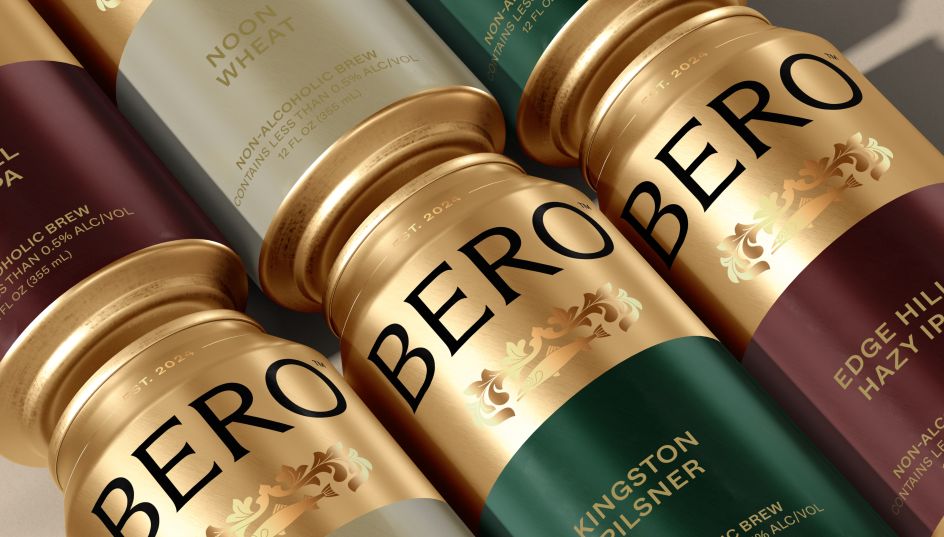
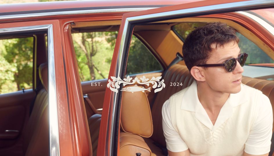
"We focused on iconography, colour, and storytelling rooted in Tom's personal experiences, such as the crest and the fish symbol on the can, which is tied to his hometown", Center explains.
The fish illustration takes inspiration from the Kingston upon Thames crest, nodding to Tom's hometown where he grew up. This also adds an element of humility and is a personal reflection of Tom's story, which, according to Center, reinforces the authenticity of the brand.
Brand first, celebrity second
From the outset, CENTER sought to create an authentic identity that could celebrate moderation without compromising on quality or experience. It was also important that BERO could stand alone as a brand, regardless of celebrity associations.
Center says, "While Tom's sobriety journey is integral to BERO, we wanted the product to be something people could connect with on its own merit."
Talking like Tom
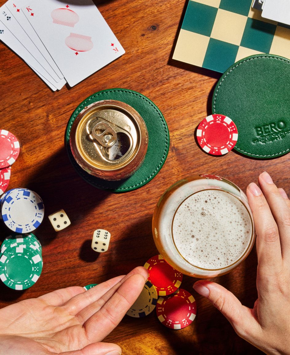
CENTER also ensured that the visuals emphasised BERO as real beer, not a substitute, positioning it as a premium product that fits seamlessly into any occasion. Center says: "Our approach was to create a brand with sophistication and legacy while making it accessible to a modern, health-conscious consumer.
"We were determined to avoid the 'consolation prize' feeling often associated with NA options."
This culminated in an approachable yet aspirational tone of voice that mirrors Tom's own. Center describes it as being "charming, confident, and genuine", noting how it strikes a balance between "inclusivity and sophistication".
London boroughs and furry friends
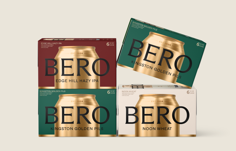
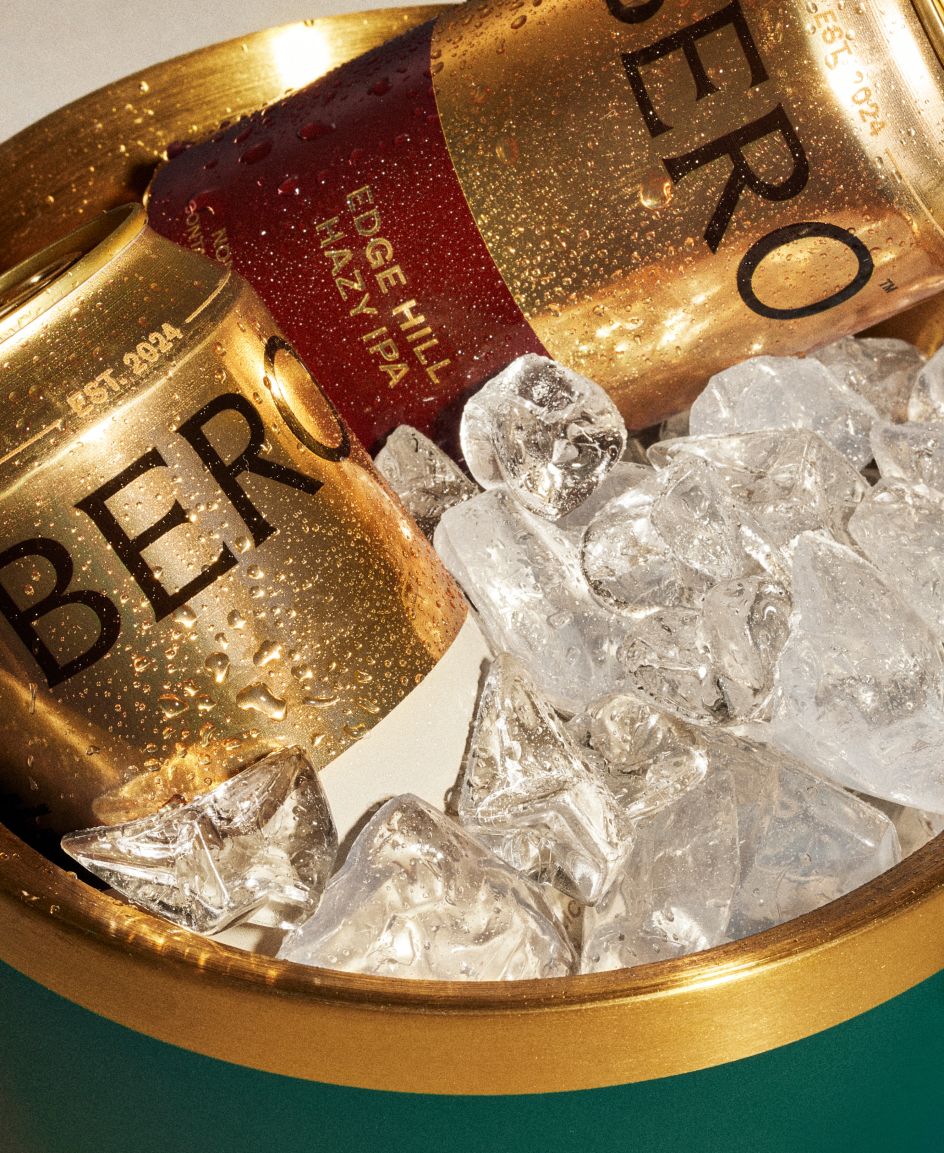
Colour obviously plays a huge role in BERO's branding and really adds to the premium look and feel. The palette draws inspiration from the crests and flags of London boroughs, with hues like Kingston Green and Brick Red, bringing warmth and richness to the brand.
The upper half of BERO's cans are cloaked in glowing gold, immediately marking it out as a premium beer. Center adds that, overall, the colours "honour tradition while creating a visual identity that feels classic yet contemporary".
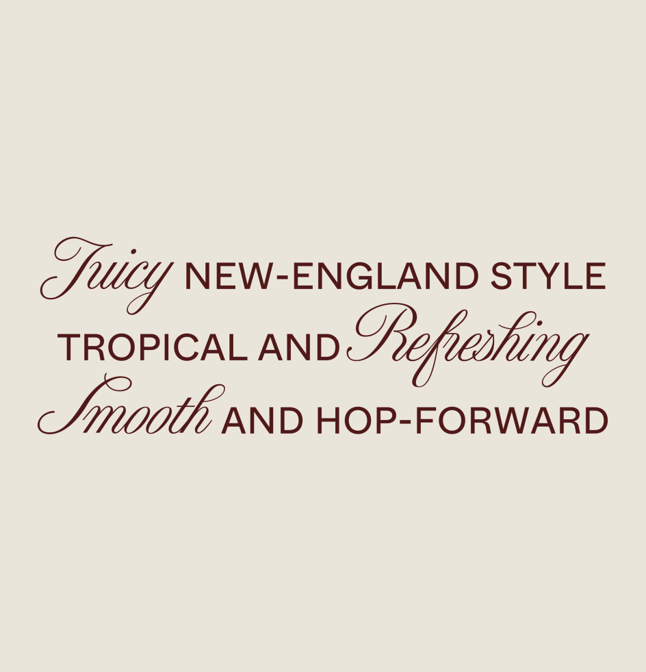
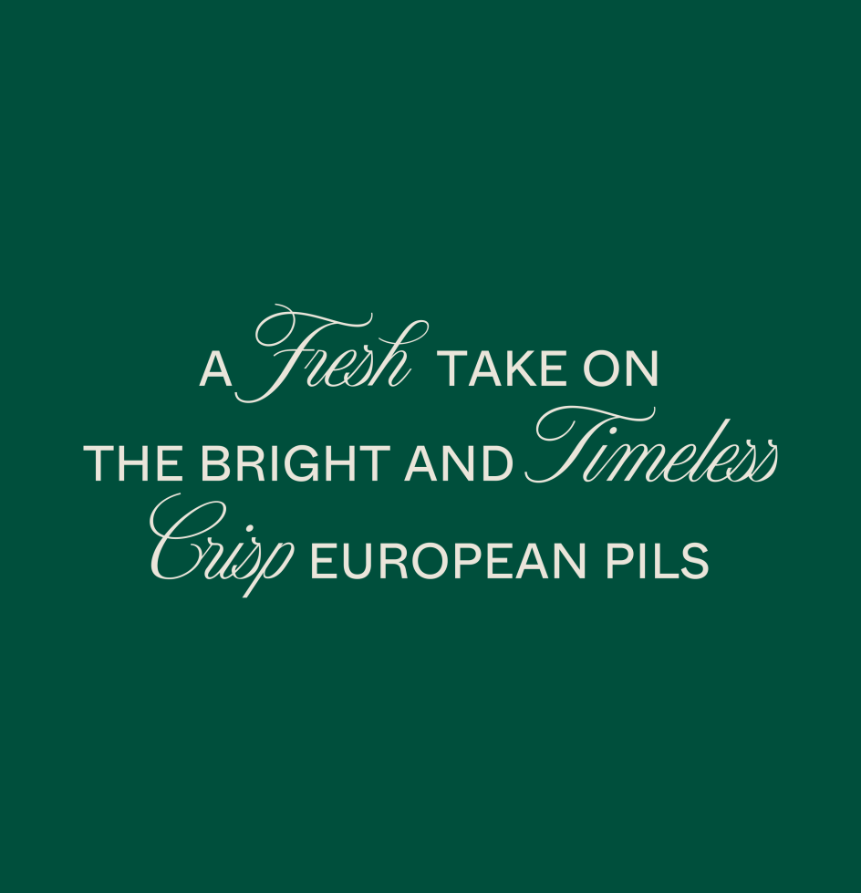
Arizona Flare by Dinamo Type Foundry was chosen as the main brand font; it is "an elegant yet strong representation of the BERO brand", says Center. He points out the slightly flared strokes in the tailored wordmark that "exude sophistication" while retaining a contemporary appeal.
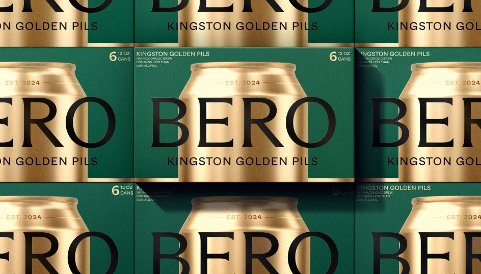
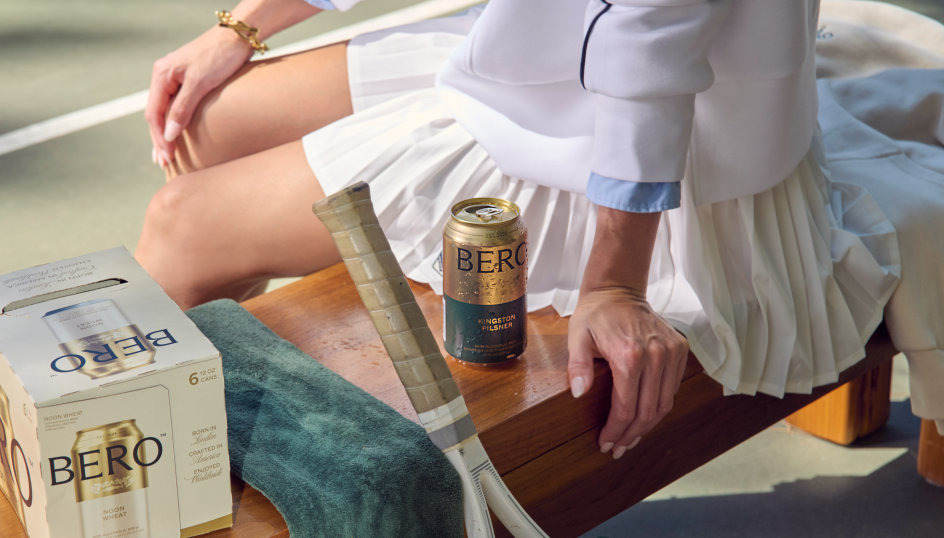
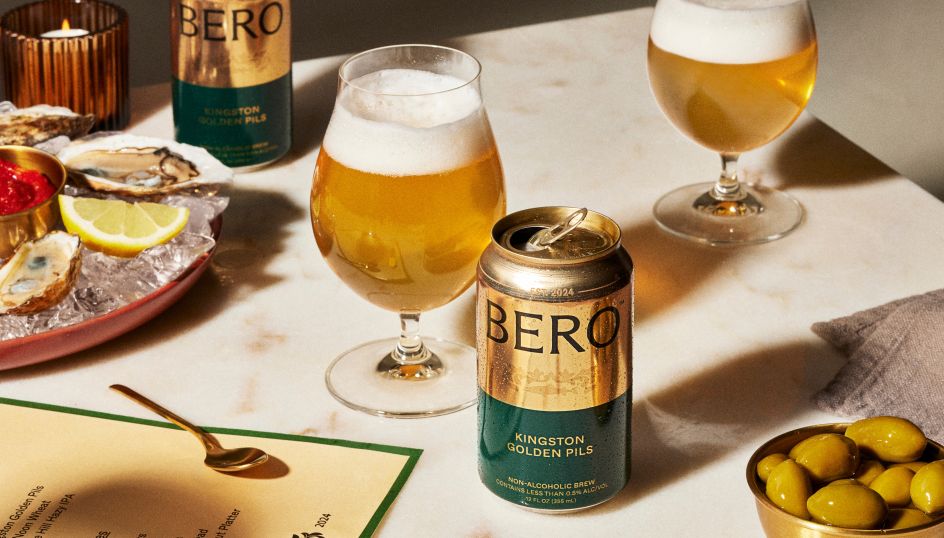
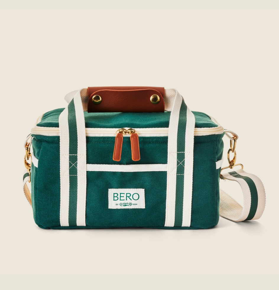
CENTER also worked on the names of the brews, which – like the brand colours – are all inspired by Tom's personal story. Kingston and Edge Hill are locations from Tom's childhood, and Noon is the name of his and Zendaya's black miniature schnauzer.
Jack Bool shot all of the brand's lifestyle photography, while Graham Pollack is responsible for all product photography.
Though BERO was initially launched in the U.S., Tom promised in a recent Instagram post that we'll soon be able to buy the beer here in the UK. Watch this space!
Editor's Picks
Trending
 using <a href=](https://www.creativeboom.com/upload/articles/6e/6ed31eddc26fa563f213fc76d6993dab9231ffe4_732.jpg) Obviously
ObviouslyPodcasts
Editor's Picks
Further Reading
Further Reading

Get the best of Creative Boom delivered to your inbox weekly
Source: Creative Boom




 by Tüpokompanii](https://www.creativeboom.com/upload/articles/58/58684538770fb5b428dc1882f7a732f153500153_732.jpg)


 Palette Perfect


